Onboarding users into your app
Earlier today I decided I could be managing my time better and therefore needed a new to-do list app (I go through this phase about once every six months). Within ten minutes I had downloaded eight different apps, briefly reviewed each one before deleting all but two of them for further investigation. There is absolutely no way that I could have made a thorough and informed decision about a piece of software in that space of time. But I wasn’t really aiming to make a thorough and informed decision: I was aiming to quickly get a feel for each app and see if they provided the functionality I desired.
It’s not just me that does this either, 77% of users will discontinue using apps within three days after downloading. These retention rates were first brought to light by Andrew Chen who highlighted that the primary reason for this dramatic curve is poor onboarding.

Onboarding is the process of brining users into an app; quickly highlighting the key features of the app, and educating them on how to use them.
Apps have a very specific window of time to take advantage of onboarding; too long and users will exit and delete the app; too short and they won’t know how to use the app, get frustrated and probably delete the app.
App onboarding is most often achieved via the following methods:
Demonstration of value proposition
Tutorials
Progressive in-app indicators
Empty states
Investment
Whichever method, or combination thereof, you choose to adopt, it should be dictated by your users and their needs. Adorable illustrations are delightful but if nobody can figure out how to add content in your app, your users won’t stick around for long.
Demonstration of value proposition
You only have a few seconds to get your users excited for your app, so use them wisely. Communicating your value proposition can be a great tool for keeping users engaged long enough to begin creating content. Highlight what your users can achieve and benefit from, rather than reiterate functionality. Just remember to keep it short and direct. Every screen that separates your user from your app’s actual functionality is a threat to your retention rates.
Here are a few tips on how to maximise the impact of your value proposition in your onboarding flow:
3 screens maximum. I don’t care how excited you are about your app’s features. Your users will never use them if they never reach them.
1 Headline + 2 lines of description is plenty.
Eyes are attracted to movement so include animations if possible. Bonus points if the animation can communicate how to interact with your app.
Don’t just let your users know the features of you app. Let them know what they can do with the features and how the user will benefit from using them.
Always include a skip button. The impatient among us will be grateful.

Slack has a total of 3 screens in their onboarding process, and a login screen to immediately give users access to functionality.
Dropbox utilises simple hand drawn animations showing how users can benefit from the app. Telling me that I can “back up your photos from the bus” not only tells me I can back up my photos, but I can do it anywhere and at anytime. They also include a call to action on every screen ensuring that users can jump straight in, and don’t have to sit through the entire animation if they aren’t so inclined.

Dropbox combines their value proposition animations with their sign up screen.
Tutorials
Tutorials or walkthroughs can be incredibly valuable for communicating how to use your app, but they have a time and a place. Try and recall the last time you read through an entire tutorial or manual. How many times did you pause the video, or scroll back a few paragraphs to refresh your memory on how to do something that was literally explained to you two minutes ago? A tutorial asks users to take in a lot of new information very quickly and then hope that they remember it all. Therefore any tutorial that lasts longer than 20 seconds is going to require a refresher.

Gmail includes tutorial style onboarding screens to explain to users how to perform basic actions in the app.
If possible, distill your tutorial into the three primary functions required by your app into a quick (and ideally animated) guide. If your tutorial is getting too lengthy you might want to consider a hybrid of tutorials and in-app reactive tips. Every screen a user has to swipe past that is potentially another barrier to your retention rates.
Progressive in-app indicators
Also known as the Let Your Users Tell You When They Need Help method. Progressive in-app indicators are also known as reactive and proactive guides. They are similar to tutorials in that they educate users on how to complete functions but they do not follow the standard step-by-step format. In-app indicators provide contextual information on how to complete functions based on a users current position in the app.
There are many forms of progressive in-app indicators that can be used to your advantage including (but not limited to):
Coach marks
Contextual tips
Empty states
Coach Marks
Coach marks are usually used when it is known that a user has not accessed a particular screen before. The screen will typically fade to black and a message will pop up informing the user how to complete a certain action. Coach marks can be useful for communicating a single interaction, eg. “swipe to the left to edit” but can fall into the same trap as tutorials if multiple marks are displayed at the same time, bombarding your user with information they will most likely forget as soon as the coach mark fades away.
Contextual Tips
Contextual tips pop up once a user has interacted with a feature or will very shortly. These tips should inform a user of how to complete a certain function or where a certain feature is located. They should be obvious but not aggressive (speech bubbles or hints are often utilised here) and briefly indicate how to interact with a feature. Tips and hints should be used sparingly and only where the UI cannot speak for itself.

Evernote utilises both contextual tips and coach marks to help their users.
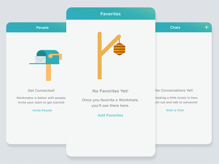
Empty States
Empty states are the bread and butter of in-app guidance, particularly where the app’s core functionality is based on user content. No user content to display yet? Don’t leave a blank screen or a fierce “No content here” style message. This is essentially a dead-end hallway that your users have spent significant time walking down. Instead prompt the user to create content. Indicate where and how they can do this. Provide some examples of other users’ content. Provide templates for content. Don’t tell your users there is no content (because that should be pretty obvious): tell them how to fill the gap.
AirBnB uses their empty state to explain what should be shown and encourages users to start creating content.
Empty states are a great place to get creative and highlight the tone of your app. There are plenty of examples of empty states that manage to inform users of the lack of content while appearing playful and lighthearted.
The example below uses animation to mitigate the negativity of the message while also including a clear call to action to prompt the user for content.
Investment
Creating investment encourages continued engagement: users will continue to use what they have worked for. Features such as avatar creation or profile building in your onboarding process create user engagement helping reinforce the value of your app. Gamification is also another means of creating engagement early on in your onboarding process (read our blog on gamification).
Waze introduces the user as a “baby wazer” from which the user can grow through consistent engagement with the app. This creates investment through achievement and ensures higher retention rates.

Onboarding often includes the sign-up process and asks users to provide personal information before they begin to create content. While this definitely creates investment, you might lose your users before they even get to the functionality. Make sure you’ve considered the appropriate time for gathering information about your user. If it’s not integral to the functionality that your user add a profile picture during the sign-up process, then let them do that later. Let them take their time with processes that require personality, thought and self-image: your users will appreciate it. Of course, sometimes a lengthy sign up process is required. A medical app for instance, might require a bit more personal information before the user can benefit from the app’s functionality. If this is the case, let the user know what’s going on, how long it will take, and why gathering this information is important. Visual queues such as progression indicators, and short descriptions will make sure your user isn’t left in the dark and won’t abandon the process before even getting into the guts of the app.
Basically, it all comes down to your first-time users, their needs and their tendencies. Conduct user testing often and early to determine how much hand-holding they require, whether your value proposition is clearly communicated and whether they are likely to stick around.
References
Aptimize(2016, February 17).The 4 Best Mobile User Onboarding Flows We’ve Seen So Far. Retrieved from https://apptimize.com
Babich, N.(2017, January 14).Best Practices for Onboarding. Retrieved from https://uxplanet.org
Chen, A.(n.d.).New data shows losing 80% of mobile users is normal, and why the best apps do better. Retrieved from http://andrewchen.co
Dye, J.(2016, March 4).77 percent of users never use an app again 72 hours after installing. Retrieved from https://www.androidauthority.com
Harley, A.(2014, February 16).Instructional Overlays and Coach Marks for Mobile Apps. Retrieved from https://www.nngroup.com
Marrs, M.(2016, April 27).App Onboarding 101: 7 Tips for Creating Engaged, Informed Users. Retrieved from http://info.localytics.com